Fitme App Case Study
Project Overview
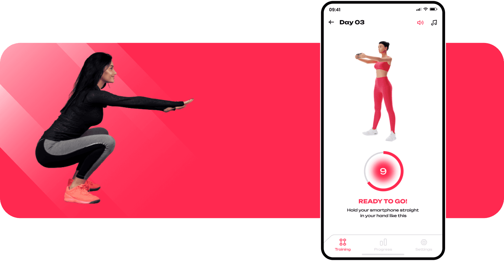
FitMe is a fitness app focused on making squats more engaging and tailored for each user. It offers two workout modes—Smart Squats, using smartphone sensors to auto-track reps, and Classic Squats for manual counting. The app customizes workouts based on gender, fitness level, and goals, providing a personalized experience with animated trainers. Users can track their progress and improve over time with adaptive workout levels and detailed session tracking.
Key Features
Smart & Classic Squats: Automated or manual tracking options.
Personalized Guidance: Tailored based on user data.
Adaptive Levels: Workouts adjust to fitness levels.
Progress Tracking: Logs each session for improvement.


01
Research & Planning
In the research and planning stage, our team focused on gathering all the necessary information and insights to inform the design process for the app. We started by understanding our target audience—identifying who they are, their fitness goals, preferences, and pain points. To do this, we conducted surveys, interviews, and user observations, gathering valuable data directly from potential users. Next, we analyzed competitors in the market. Our team examined other fitness and squat apps to identify their strengths and weaknesses, noting what features they offer and how they address user needs. This competitive analysis helped us find opportunities to differentiate our app and offer unique value to our users. By thoroughly understanding both our audience and the competition, we laid a strong foundation for the design process.

02
User Flow
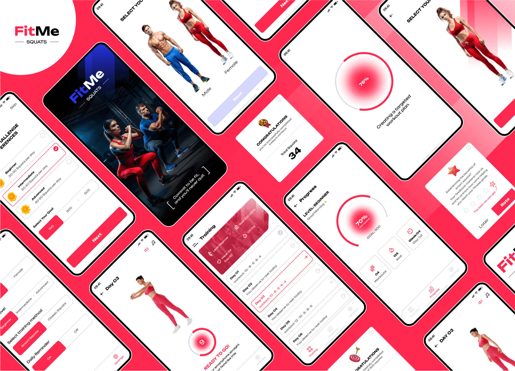
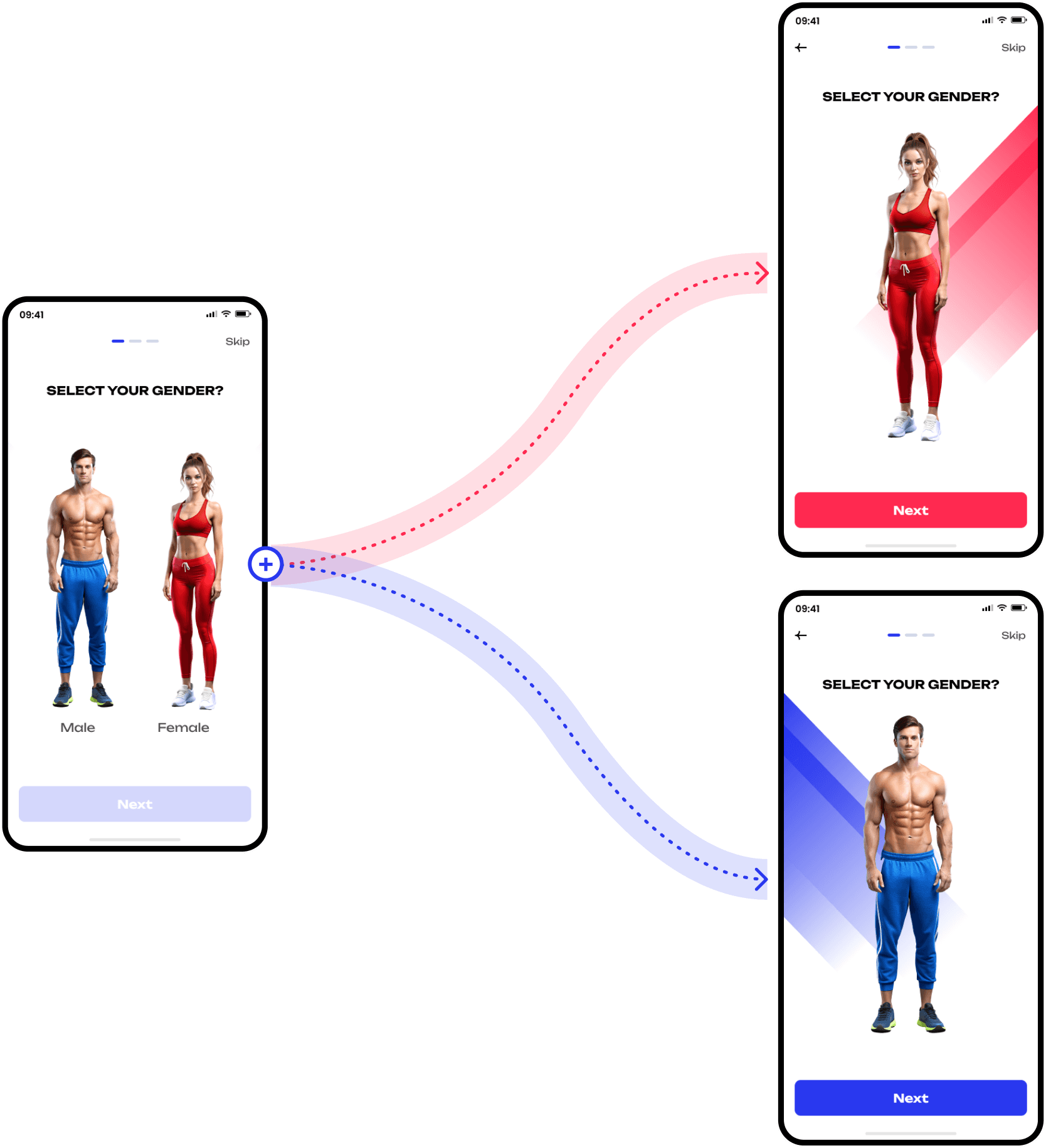
Users start by selecting Smart Mode or Classic Mode, followed by choosing Gender, Fitness Level, and Goal. The app then creates a personalized workout plan, tracks progress, and provides real-time guidance using smartphone sensors in Smart Mode.

03
Wireframing & Low-Fidelity Design
Once we defined FitMe’s core features, we sketched out low-fidelity wireframes to lay out the app’s primary functions, including onboarding, workout selection, and progress tracking. These wireframes focused on structuring the user flow and ensuring that each screen felt intuitive, making it easy for users to navigate through their fitness journey.

04
Design System
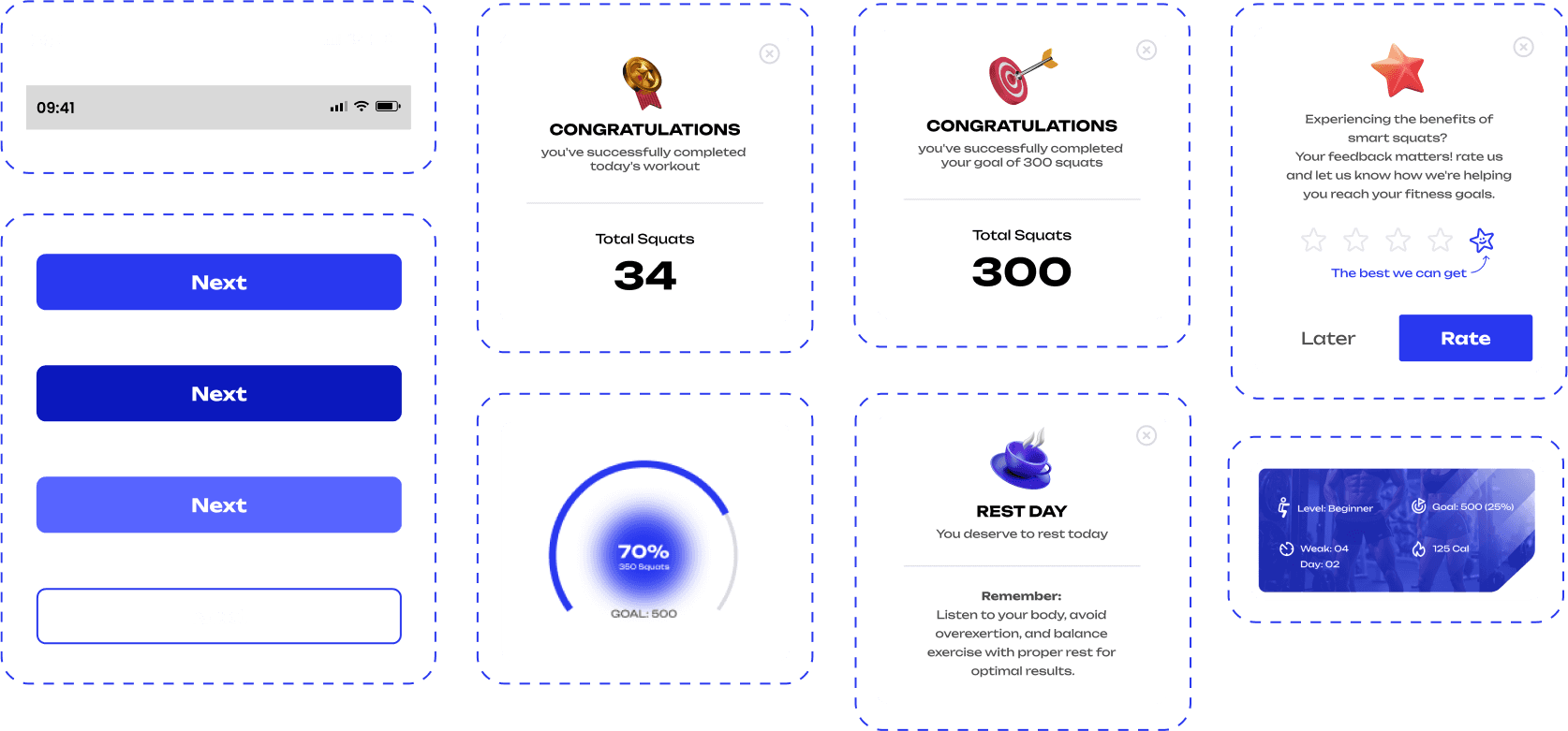
The design system uses the Unbounded font in Regular, Semi-Bold, and Bold weights, ensuring readability and consistency across various text sizes. The color palette combines Palatinate Blue (#2938EF), Awesome Red (#FF2950), Gainsboro/Light Gray (#D5D6E3), and Arsenic (#3E3F4D) to create a modern, vibrant, and visually engaging interface.
Typography

Color Palette

UI Components
05
Visual Design (High-Fidelity, Inspiration
& Mood Board)
For the high-fidelity design, we drew inspiration from modern, minimalistic fitness apps and crafted a mood board emphasizing energy and motivation. Our color scheme centered around vibrant shades of blue to convey trust and calmness, balanced with whites for a clean, modern feel. Typography and imagery were chosen to be bold and motivating, aligning with the app’s purpose to drive users toward their goals.

06
Prototyping
The interactive prototype helped us visualize and test FitMe’s flow in a real-use scenario. This prototype allowed users to explore core features like setting goals, tracking workouts, and viewing progress. Prototyping uncovered minor UX improvements, such as clarifying iconography and refining transitions, making the app feel seamless and responsive.
07
User Testing
To fine-tune the user experience, we conducted usability testing with a diverse group of users. Feedback was overwhelmingly positive, especially regarding the app's ease of use and motivating design. However, some users suggested refinements to the onboarding experience and more explicit labeling for certain features. We made these adjustments, improving clarity and accessibility to ensure a positive experience from the start.
08
Final Design & Handoff
The final design embodies FitMe’s brand values: simplicity, motivation, and functionality. Key screens such as onboarding, workout plans, and progress tracking are designed to be visually appealing and easy to use. For the development team, we provided a detailed design handoff with annotated prototypes, assets, and style guidelines, ensuring a smooth transition from design to development.

Thank You for Scrolling…
Let’s connect and create something exceptional together!